PT | O objetivo deste projeto é criar um redesign para a empresa Mia Studios, deixando a marca Forte, Profissional e Inovadora.
Mia vem do Italiano que significa “Minha”, ‘’Minha empresa’’, ‘’Minha solução”. A Mia Studios oferece uma ampla gama de serviços criativos e técnicos, incluindo level design, design em geral, modelagem 3D, programação e desenvolvimento. Com isso, a marca pretende mudar a sua identidade visual por não refletir o momento hodierno da marca.
EN | The objective of this project is to create a redesign for Mia Studios company, leaving the brand Strong, Professional and Innovative.
Mia comes from Italian which means “My”, ‘’My company’’, ‘’My solution”. Mia Studios offers a wide range of creative and technical services, including level design, general design, 3D modeling, programming and development. With it, the brand intends to change its visual identity as currently it does not reflect the actual moment of the brand.


PT | O conceito principal do símbolo da Mia Studios é um olho, que é um elemento presente desde a criação da empresa, junto com o coração que representa a união, tanto com seus colaboradores, quando clientes, a empresa se considera como uma grande família. Ele é protegido por cubo maior, representando a segurança e força da empresa. No espaço negativo é possível notar que o coração é rodeado por uma pessoa que está abraçando-o, e isso também reforça a proteção e confiança que a Mia quer repassar a seus clientes e colaboradores.
EN | The main concept of Mia Studios' symbol is an eye, which has been a part of the company since its inception, along with the heart that represents the unity of the company, both with its employees and clients; the company considers itself a big family. It is protected by a larger cube, symbolizing the security and strength of the company. In the negative space, you can see that the heart is surrounded by a person embracing it, which also reinforces the protection and trust that Mia wants to convey to its clients and employees.


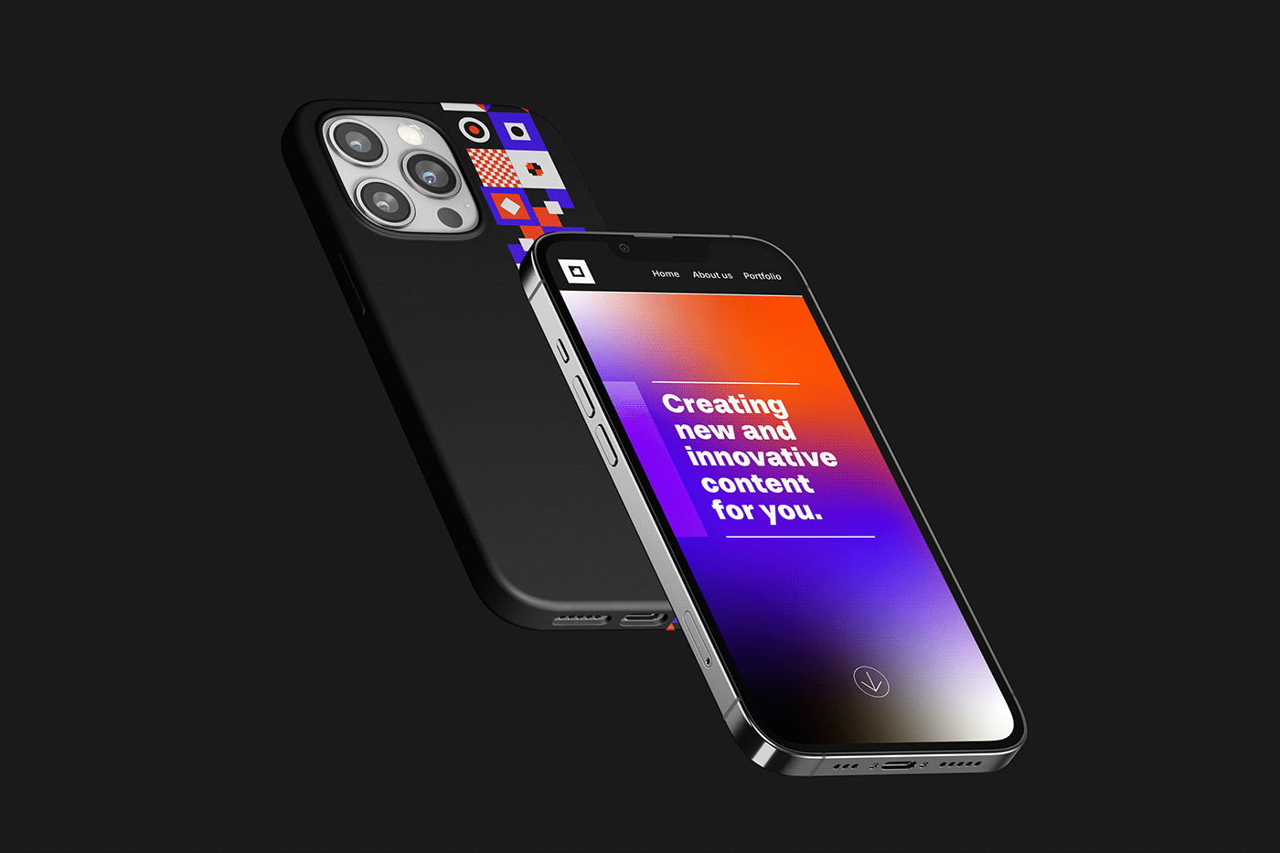
PT | O laranja é a cor principal da marca, ela representa criatividade e confiança. A cor de apoio é o roxo, que combina muito com o laranja, ela reprenta estabilidade, confiança, criatividade, força e tecnologia. As cores preto e branco foram adicionadas com o intuito de dar mais contraste com as demais cores. Além de dessas cores trazerem algo mais sofisticado e elegante, completando assim a personalidade da marca.
EN | Orange is the main color of the brand; it represents creativity and confidence. The supporting color is purple, which complements orange very well; it symbolizes stability, trust, creativity, strength, and technology. The colors black and white were added to provide more contrast with the other colors. In addition to adding a touch of sophistication and elegance, these colors complete the brand's personality.